Recently, as part of a team-building activity, me and a bunch of work colleagues went to a karting track. The format was quite simple: 5 minutes of practice/qualifying, followed by a 15 minute race. I went to this karting affair with absolutely no racing experience other than playing Gran Turismo 51 and watching way too much Formula 1, and did pretty well in qualifying, starting P3! Unfortunately my lack of experience surfaced during the race and I spun a couple of times in a tricky hairpin, and as a result I ended up P7 by the checkered flag.
We were about to leave the track, when something unexpected happened: they gave us two sheets with everyone’s lap times, for both the qualifying and the race! We ended up spending the lunch poring over the data, with everyone comparing their lap times to everyone else’s. That was when I got the idea: we have the raw lap time data, we could pull out some really neat statistics from it! I have seen plenty of F1 analytics Twitter accounts posting charts about Formula 1 qualifying and race sessions, it would be fun to do something similar for a race that in which I was an active participant.
Parsing the lap time data Link to heading
The first step in this rather silly side project is to extract the lap times from the sheets given to us by the karting track. Sadly I don’t have any silver bullets for you: I just sat down and copied the values by hand. It’s easy to make a mistake with data entry, but luckily for us the sheets also came with an average lap time per driver, which I was able to compute and compare for a sanity check.
QUALIFYING = {
    "FT": ["1:07.125",   "57.652",   "56.817",   "57.383", "1:00.082"],
    "MF": ["1:22.641", "1:05.738",   "58.961",   "57.832", "1:03.613"],
    "DM": ["1:17.055", "1:01.305", "1:14.781",   "59.715", "1:00.090"],
    "EO": ["1:13.242", "1:00.239", "1:00.554",   "59.805", "1:02.660"],
    "RM": ["1:26.934", "1:07.441", "1:02.844", "1:01.027"],
    "DL": ["1:05.973", "1:02.847", "1:02.590", "1:02.340", "1:01.649"],
    "FR": ["1:23.523", "1:13.407", "1:09.519", "1:04.473"],
    "RV": ["1:28.496", "1:10.340", "1:05.187", "1:07.911"],
    "MC": ["1:31.586", "1:14.031", "1:07.582", "1:05.520"],
    "JS": ["1:23.668", "1:18.141", "1:06.277", "1:08.086"],
    "TG": ["1:30.301", "1:17.484", "1:09.547", "1:18.750"],
    "MT": ["1:36.375", "1:21.176", "1:15.015", "1:13.414"],
}

RACE = {
    "FT": ["1:02.441",   "56.949",   "57.274",   "55.973",   "56.578",   "55.750",   "57.367",   "57.996",   "56.340",   "56.539",   "56.519",   "56.368",   "58.273",   "56.262",   "56.242",   "56.738"],
    "MF": ["1:04.832",   "56.730",   "56.809",   "58.492",   "56.922",   "57.012",   "56.730",   "57.649", "1:00.254",   "56.988",   "56.949",   "57.656",   "56.926",   "57.192",   "56.898",   "57.875"],
    "RM": ["1:05.293", "1:00.328",   "59.629", "1:00.051",   "58.464",   "58.551",   "58.313",   "58.441",   "59.285",   "58.844",   "57.625",   "57.641",   "58.043",   "57.961",   "57.957",   "56.828"],
    "DL": ["1:06.437", "1:01.700",   "59.628",   "58.184",   "58.012", "1:04.875",   "57.765",   "59.340",   "59.375",   "58.383",   "58.906",   "58.067",   "57.851",   "58.360",   "57.570",   "59.984"],
    "RV": ["1:05.672", "1:00.828", "1:06.399", "1:01.742",   "59.511",   "58.883",   "58.270",   "58.465",   "58.515",   "58.180",   "58.953",   "58.051",   "58.355",   "57.778",   "58.328",   "58.570"],
    "EO": ["1:01.371",   "59.590",   "56.785",   "58.789",   "58.781",   "59.278",   "58.113", "1:00.621",   "59.742", "1:01.391",   "58.832", "1:01.023", "1:01.957", "1:09.274", "1:02.312", "1:03.426"],
    "DM": ["1:05.929", "1:01.957", "1:05.582", "1:02.762", "1:05.270", "1:03.050",   "59.492",   "59.555",   "58.590", "1:00.895", "1:00.113",   "57.988",   "58.785",   "58.055",   "58.723"],
    "JS": ["1:07.297", "1:02.656", "1:01.730", "1:00.868", "1:01.402",   "59.836", "1:00.004", "1:02.472", "1:00.883", "1:01.348", "1:02.402", "1:00.282",   "59.570", "1:00.664", "1:00.769"],
    "MC": ["1:17.024", "1:01.070", "1:10.985", "1:01.961", "1:02.449", "1:02.293", "1:01.140",   "57.891",   "58.156",   "58.270",   "58.160",   "58.238",   "57.113", "1:01.989", "1:09.355"],
    "TG": ["1:10.625", "1:05.977", "1:07.887", "1:05.199", "1:05.277", "1:03.434", "1:02.250", "1:01.648", "1:00.156", "1:01.164", "1:01.090", "1:02.098", "1:02.242", "1:00.801", "1:01.531"],
    "FR" :["1:05.433", "1:11.707", "1:05.246", "1:05.453", "1:04.219", "1:04.195", "1:03.840", "1:05.200", "1:01.394", "1:02.121", "1:03.754", "1:03.531", "1:03.438", "1:01.676", "1:01.734"],
    "MT": ["1:11.210", "1:07.872", "1:05.664", "1:07.297", "1:03.574", "1:05.109", "1:10.774", "1:18.726", "1:14.524", "1:11.015"],
}
The drivers are identified by their initials2 rather than their full names to give them some level of anonimity.
Converting to a Pandas dataframe Link to heading
We have our raw data, but before we can start doing interesting data manipulation and visualization, we have to convert it to a dataframe.3
def parse_lap_time(lap_time : str) -> float:
    "Converts a lap time string (eg: 1:05.664) to seconds (eg: 65.664)"
    if ":" in lap_time:
        minutes, seconds = lap_time.split(":")
    else:
        minutes, seconds = 0, lap_time

    return int(minutes) * 60 + float(seconds)

def get_data() -> pandas.DataFrame:
    "Converts the raw data from the `QUALIFYING` and `RACE` dictionaries to a pandas dataframe"
    res = []

    for session_name, session in zip(("QUALIFYING", "RACE"), (QUALIFYING, RACE)):
        for driver, laps in session.items():
            for lap_number, lap_time in enumerate(laps, start=1):
                res.append({
                    "Session": session_name,
                    "Driver": driver,
                    "Lap Number": lap_number,
                    "Lap Time": parse_lap_time(lap_time),
                })

    return pandas.DataFrame(res)
Calling get_data() yields the following:
        Session Driver  Lap Number  Lap Time
0    QUALIFYING     FT           1    67.125
1    QUALIFYING     FT           2    57.652
2    QUALIFYING     FT           3    56.817
3    QUALIFYING     FT           4    57.383
4    QUALIFYING     FT           5    60.082
..          ...    ...         ...       ...
229        RACE     MT           6    65.109
230        RACE     MT           7    70.774
231        RACE     MT           8    78.726
232        RACE     MT           9    74.524
233        RACE     MT          10    71.015

[234 rows x 4 columns]
Qualifying Link to heading
And pole position goes to… Link to heading
Let’s start with the basics: what’s the starting grid?
def qualifying_standings(df: pandas.DataFrame):
    res = (
        df[df["Session"] == "QUALIFYING"]
        .groupby(["Driver"])["Lap Time"]
        .min()
        .sort_values()
    )

    return res
    # Driver
    # FT    56.817 <-- pole position!
    # MF    57.832
    # DM    59.715
    # EO    59.805
    # RM    61.027
    # DL    61.649
    # FR    64.473
    # RV    65.187
    # MC    65.520
    # JS    66.277
    # TG    69.547
    # MT    73.414
    # Name: Lap Time, dtype: float64
FT qualified on pole by over a second ahead of MF, who in turn gapped me by 1.9 seconds… there’s levels to this.
Lap time evolution Link to heading
As we got more comfortable with the karts, we were able to set faster lap times. Let’s visualize this.
def lap_time_progression(df: pandas.DataFrame, session: Literal["QUALIFYING", "RACE"]):
    res = df[df["Session"] == session]

    seaborn.lineplot(res, x="Lap Number", y="Lap Time", hue="Driver", style="Driver", linewidth=3)

    # Force integer x ticks
    pyplot.gca().xaxis.set_major_locator(MaxNLocator(integer=True))

    # Draw horizontal grid lines
    pyplot.grid(axis='y', alpha=0.7)

    pyplot.show()
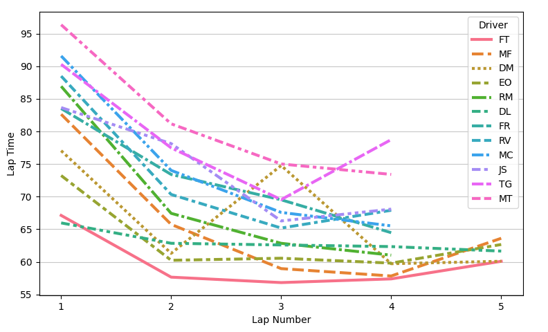
We can see that by lap 3/4 we were setting our PBs. Lap 1 was significantly worse than all the other laps not necessarily due to a lack of confidence, but because it was an outlap (i.e. the lap was started from standstill in the pit lane).
“The line chart reveals a few things: FT is both very quick and consistent, and DM (me) made a lot of mistakes in lap 3. However, the need to be able to distinguish all the lines belonging to different drivers makes this chart hard to read.
Lap time distribution Link to heading
Instead of having a line chart, we can have a swarm plot of the lap times per driver. Let’s also take the opportunity to remove the outlap.
def lap_time_distribution(df: pandas.DataFrame, session: Literal["QUALIFYING", "RACE"], ignore_first_lap: bool = True):
    res = df[df["Session"] == session]

    if ignore_first_lap:
        res = res[res["Lap Number"] > 1]

    seaborn.catplot(res, kind="swarm", x="Driver", y="Lap Time", hue="Lap Number", s=200)

    # Draw horizontal grid lines
    pyplot.grid(axis='y', alpha=0.7)

    pyplot.show()
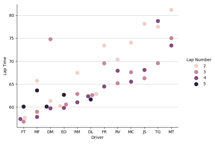
This visualization is far clearer than the line chart, and we even preserve the lap time number information with the hue of the dots!
On a side note, can we take a moment to appreciate how bad my lap 3 is? 15 seconds off the pace - without exaggerating, I must have spun 3 million times.
Race Link to heading
The race was three times longer than qualifying, which means the number of laps to analyse increases threefold. The unique nature of a race also means that there are more opportunities for other types of visualizations.
Lap time distribution Link to heading
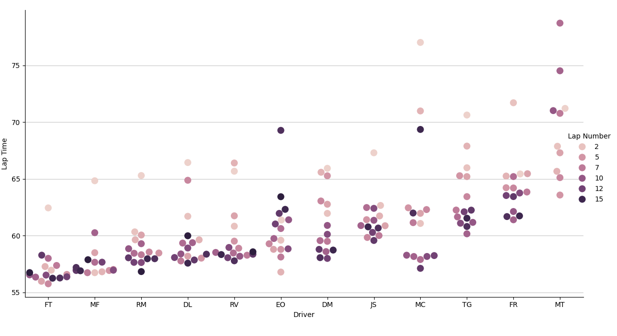
There is a clear distinction between the top 5, with metronomic pace, and the rest of the drivers, whose pace was a bit all over the place. There’s another interesting detail: most of the outlier laps were set in the beginning of the race, and by the end most drivers were able to settle into a rhythm.4
Race trace Link to heading
There is a special visualization that we can use to track the gaps between the drivers, called race trace. To make use of it, we first must calculate the total race time, per lap: for example, if I my lap times are 1:03, a 1:02 and a 1:05, my total race time at the end of lap 3 would be 3:10.
def calculate_cumulative_lap_times(df: pandas.DataFrame) -> pandas.DataFrame:
    res = df[df["Session"] == "RACE"].drop(columns=["Session"])

    cumulative_times = []

    # Calculate the cumulative sum of lap times _per driver_
    for driver in res["Driver"].unique():
        cumulative_times.append(
            res[res["Driver"] == driver]["Lap Time"].cumsum()
        )

    res["Cumulative Lap Time"] = pandas.concat(cumulative_times)

    return res
Plotting a graph with the Cumulative Lap Time column would already give us lines that reflect the gaps between drivers, but all these lines would be slope diagonally upward. Live race trace tools usually deal with this by computing an average total race time and subtracting that average from everyone’s Cumulative Lap Time. We can take an easier approach and manually pick a value that makes our chart look good.
def calculate_race_trace_offsets(df: pandas.DataFrame) -> pandas.DataFrame:
    df["Race Trace Offset"] = df["Cumulative Lap Time"] - df["Lap Number"] * 60

    return df

    #     Driver  Lap Number  Lap Time  Cumulative Lap Time  Race Trace Offset
    # 53      FT           1    62.441               62.441              2.441
    # 54      FT           2    56.949              119.390             -0.610
    # 55      FT           3    57.274              176.664             -3.336
    # 56      FT           4    55.973              232.637             -7.363
    # 57      FT           5    56.578              289.215            -10.785
    # ..     ...         ...       ...                  ...                ...
    # 229     MT           6    65.109              400.726             40.726
    # 230     MT           7    70.774              471.500             51.500
    # 231     MT           8    78.726              550.226             70.226
    # 232     MT           9    74.524              624.750             84.750
    # 233     MT          10    71.015              695.765             95.765
Now that we’ve flattened our race trace, let’s take a look at it:
def race_trace(df: pandas.DataFrame):
    seaborn.lineplot(df, x="Lap Number", y="Race Trace Offset", hue="Driver", style="Driver", linewidth=3)

    # Force integer x ticks
    pyplot.gca().xaxis.set_major_locator(MaxNLocator(integer=True))

    # Draw horizontal grid lines
    pyplot.grid(axis='y', alpha=0.7)

    pyplot.show()
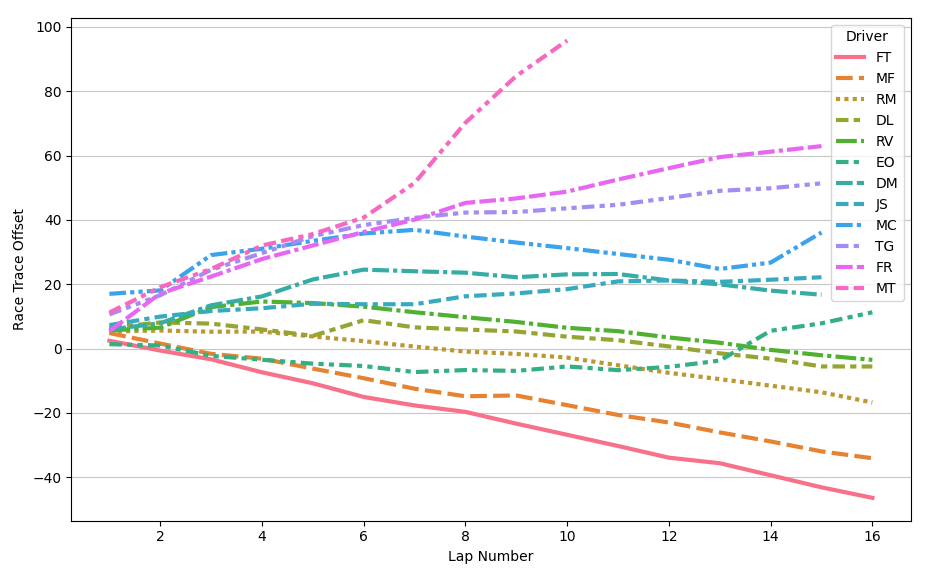
This singular chart tells us the history of the race. There’s so many details one can glean from it:
- By the end of the first lap, the field spread was already close to 20 seconds!
- The top 3 have similar pace. It’s a shame that
RMqualified a bit too far back: by the time he clearedDLthere was nothing he could do. - I have no doubt in my mind that
FTcould start dead last and still finish on the podium. EOhad an incredible start (he started P4 on the grid) and then gradually fell away. What happened on laps 13/14? I’ll have to ask him when I see him.MChad the exact opposite situation: horrendous start followed by some very decent pace.- You can really see the moment where
MTstarted having technical issues.
Track position Link to heading
It is possible to create a cleaner version of the race trace if you only care about the track position and disregard the time gaps between the drivers: instead of using the total race time to create the race trace, we will use it to order our drivers in every lap and save this order in a new column.
def calculate_track_position(df: pandas.DataFrame):
    race_df = calculate_cumulative_lap_times(df)

    # For every lap of every driver, calculate their track position
    positions = {}

    for lap_number in race_df["Lap Number"].unique():
        laps = race_df[race_df["Lap Number"] == lap_number].sort_values(by="Cumulative Lap Time")

        for position, (index, _) in enumerate(laps.iterrows(), 1):
            positions[index] = position

    race_df["Position"] = pandas.Series(positions)

    race_df = race_df[["Driver","Lap Number", "Position"]] # Only keep the columns we need

    # Add the starting grid as a fake lap 0 to make the data more complete
    starting_positions = []
    for position, driver in enumerate(qualifying_standings(df).keys(), 1):
        starting_positions.append({
            "Driver" : driver,
            "Lap Number" : 0,
            "Position" : position,
        })

    return pandas.concat([race_df, pandas.DataFrame(starting_positions)], ignore_index=True)

    #     Driver  Lap Number  Position
    # 0       FT           1         2
    # 1       FT           2         1
    # 2       FT           3         1
    # 3       FT           4         1
    # 4       FT           5         1
    # ..     ...         ...       ...
    # 188     RV           0         8
    # 189     MC           0         9
    # 190     JS           0        10
    # 191     TG           0        11
    # 192     MT           0        12
Plotting the chart is quite straightforward:
def race_track_position(df: pandas.DataFrame):
    seaborn.lineplot(df, x="Lap Number", y="Position", hue="Driver", style="Driver", linewidth=3)

    # Force integer x ticks
    pyplot.gca().xaxis.set_major_locator(MaxNLocator(integer=True))

    # Draw horizontal grid lines
    pyplot.grid(axis='y', alpha=0.7)

    pyplot.show()
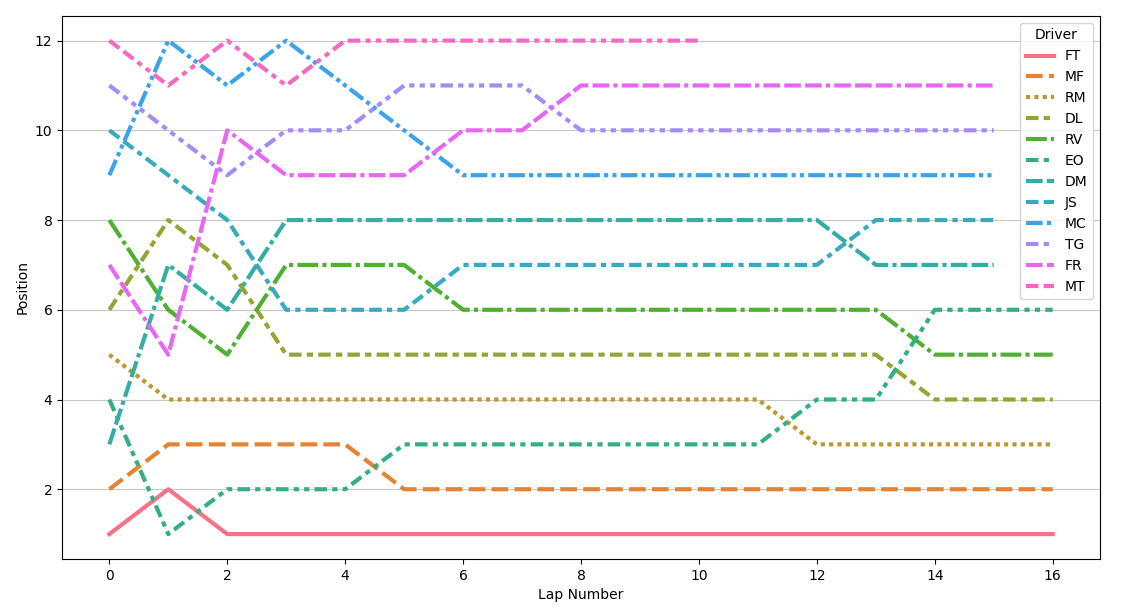
Watching the race start of an F1 race is one thing… being part of a race start yourself is an entirely different experience. One thing I can tell you for sure is that I’ll never backseat during an F1 race ever again.
Final notes Link to heading
I hope you enjoyed reading this post. Personally, I’m just glad I found a straightforward topic to write about, especially after struggling to perform cryptanalysis on Enigma cyphertexts5. If you are interested in the code for these data visualizations, you can find it here.
-
I did manage to complete the Sebastian Vettel X Challenge, though! The folks that have played GT5 will know how tricky this challenge is. ↩︎
-
I’m
DM, for example. ↩︎ -
There is an interesting wrinkle here: we have two different sessions, so should we create two separate dataframes? I ended up using just a single dataframe with an additional
Sessioncolumn to indicate from which session the lap came from, but in retrospect I feel that having two separate dataframes would be the more elegant approach. ↩︎ -
There are two exceptions to this general trend:
EOwas losing pace hand over fist by the end of the race for some reason, andMThad a technical issue that led to him not being able to finish the race. ↩︎ -
It’s a shame I didn’t manage to pull it off, I even had a great blog post title for it and everything! ↩︎